Little angel – ink and watercolour, 230 x 160 mm, 2012.
The little angel on the top of our Christmas tree inspired this week’s Shoot it, Sketch it (yes, it’s a fake tree — I’m allergic to the pine variety). I knitted her years ago using one of Jean Greenhowe’s wonderful patterns — she was a fairy in the pattern book but I turned her into an angel by making a halo instead of a bow. She’s about 100 mm tall.
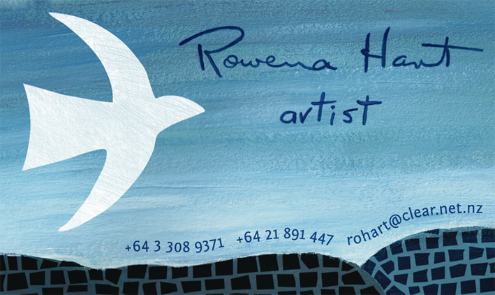
Artist Rowena Hart has a lovely daughter. Her daughter, Marnie, was one of my tutors at the college where I studied communication arts and design. How amazing to be asked by my former tutor to design a business card for her mum as a surprise birthday present. To say that I feel honoured doesn’t even come close.
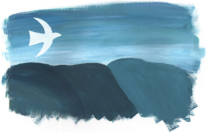
Of course I wanted to feature some of Rowena’s art in the design and the white bird is a recurring motif in her work. Rowena paints acrylic landscapes and seascapes (among other things) and also uses mosaic and collage techniques.
Landscape for Rowena #1 – acrylic on card, 150 x 250 mm, 2012.
Landscape for Rowena #2 – acrylic and digital, 150 x 250 mm, 2012.
Landscape #1 is actually two acrylic paintings put together in Photoshop. The white bird was kept on a separate layer so I could play around with placement. The mosaic pattern was drawn in ink and added later.
Rowena said she couldn’t believe that the business cards were so perfectly her!
Happy birthday, Rowena. I’m so glad you like them : )
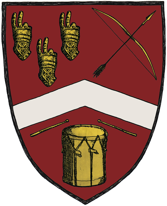
This cheeky coat of arms is part of a business card I designed for Tim Gallant. He originally asked me to design two business cards — one for his longbow-making business Pre-modern Industries and one to promote him as a drum teacher/musician. It was my suggestion to put everything on a single card by creating a coat of arms.
Tim specifically asked for a two-fingered salute to be included in the design (an insult that is also known as the Longbowman Salute, with some claiming the gesture dates back to the 1415 Battle of Agincourt). So I combined the ‘salute’ with a few other elements to create a logo that is, I hope, more humorous than offensive. The colours and placement of the elements were inspired by the Gallant coat of arms and a medieval illustration style seemed the very thing to tie it all together.
Love the shape you’re in – mixed media, 297 x 210 mm, 2012.
Here is my entry for a poster competition run by the NOW Foundation promoting the positive, healthy, inclusive portrayal of girls and women. Yes, another competition. It’s been a busy month.
My aim was to put a positive spin on the idea of body types and to create an image that would make people smile. All too often, we hear ‘pear’ and ‘apple’ shapes (et cetera) described as problems that require fixing in some way. Instead, celebrate your shape because it’s all natural and naturally beautiful. Love the shape you’re in!
The fruit characters are ink and acrylic — one is a self-portrait : ) The background collage was created using paper and gesso. I added the heart spotlight in Photoshop.
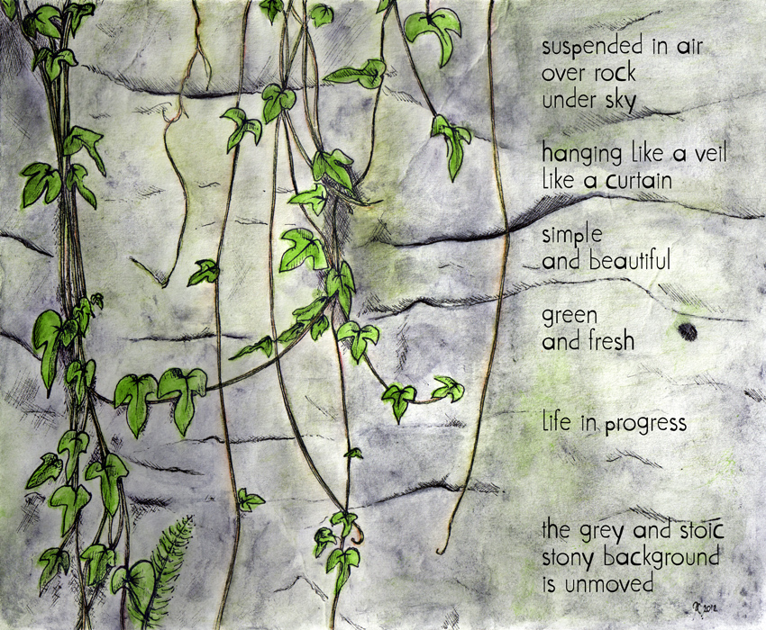
Leaf study – ink, watercolour and digital, 175 x 210 mm, 2012.
This week’s sketch was a bit of an experiment. I wanted to see how watercolour behaved when applied to art board. Now I know. The biggest surprise was just how much water I could wash over the surface without it buckling.
All it needed was a little poem to finish it off (so I wrote one).