
The green background texture is an acrylic painting. The images are ink drawings. I really do enjoy designing logos and business cards!
The green background texture is an acrylic painting. The images are ink drawings. I really do enjoy designing logos and business cards!

Visual diary, two-page spread (student project, 2010)
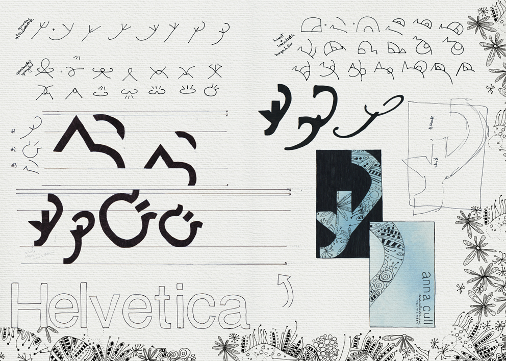
Visual diary, two-page spread (student project, 2010)
A recent blog post by graphic designer Becca Shayne about the value of keeping a sketchbook reminded me of the visual diary I put together for my Design & Arts College exhibition in 2012. All of my course sketchbooks (crammed full of research, ideas, inspirational quotes, word maps, doodles and sketches) had to be edited into a single, professionally printed journal of only 72 pages. It was no easy task but it’s something I’ll always treasure.
These are the diary pages of our very first project: to design our own logo and business card. I really enjoyed the process but I didn’t like the logo enough to use it. I’m still very fond of Helvetica though.
![]()
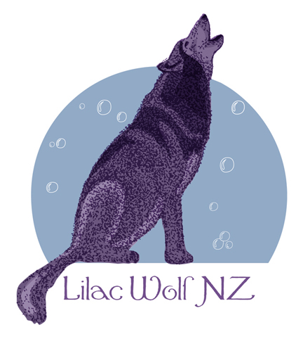
I entered this design in a logo competition a few months ago. The brief was to create a logo for dog spa Lilac Wolf NZ that was positive and memorable. The concept behind the brand is that every dog dreams of feeling like a wolf and being treated like a king.
My design shows Lilac Wolf surrounded by bubbles. He imagines they are craters on the moon… or snow falling in the forest. He is howling with happiness — or is he blowing/chasing bubbles?
 These are the initial sketches. I really liked the texture of #1 but I decided to work with #2 because of the body shape.

The scanned sketch became a vector trace (flipped and altered slightly).
The traced fur was used as a guide for the coloured vector shading.

I deleted the original fur, continued to edit the shading and the bubbles, and gave the moon a gradient fill. I then redesigned the fur and tweaked a few things for the final logo.
P.S. For those who are curious, I’ve just been told that there was no winning design in the competition.

I posted the artwork for Tim Gallant’s business card a couple of months ago but needed to finalise a few details before completing the design. Tim has a longbow-making business and is a talented drum teacher/musician.
The two finger salute included in the design is a gesture sometimes referred to as the Longbowman Salute and may or may not date back to the 1415 Battle of Agincourt. I drew the ‘salute’ as a medieval gauntlet and added a couple of other elements to create a logo that is, I hope, more humorous than offensive. The colours and layout were inspired by the Gallant Family coat of arms.
The background (below) was serendipity at its best. I painted it on a piece of nothing-special cardboard using some acrylic paint left over from another project. I thought it would be quite a smooth surface but, instead, the paint accentuated every little bump and ridge…but it scanned beautifully. I tweaked the colours in Photoshop to better suit the business card and voilà. Where would we be without happy accidents?

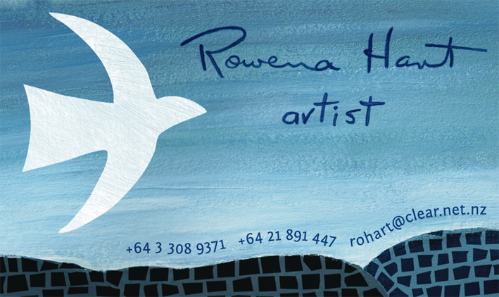

Artist Rowena Hart has a lovely daughter. Her daughter, Marnie, was one of my tutors at the college where I studied communication arts and design. How amazing to be asked by my former tutor to design a business card for her mum as a surprise birthday present. To say that I feel honoured doesn’t even come close.
Of course I wanted to feature some of Rowena’s art in the design and the white bird is a recurring motif in her work. Rowena paints acrylic landscapes and seascapes (among other things) and also uses mosaic and collage techniques.
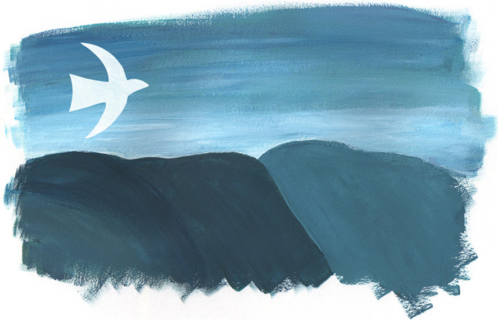

Landscape #1 is actually two acrylic paintings put together in Photoshop. The white bird was kept on a separate layer so I could play around with placement. The mosaic pattern was drawn in ink and added later.
Rowena said she couldn’t believe that the business cards were so perfectly her!
Happy birthday, Rowena. I’m so glad you like them : )
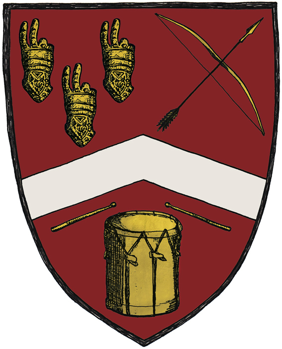
This cheeky coat of arms is part of a business card I designed for Tim Gallant. He originally asked me to design two business cards — one for his longbow-making business Pre-modern Industries and one to promote him as a drum teacher/musician. It was my suggestion to put everything on a single card by creating a coat of arms.
Tim specifically asked for a two-fingered salute to be included in the design (an insult that is also known as the Longbowman Salute, with some claiming the gesture dates back to the 1415 Battle of Agincourt). So I combined the ‘salute’ with a few other elements to create a logo that is, I hope, more humorous than offensive. The colours and placement of the elements were inspired by the Gallant coat of arms and a medieval illustration style seemed the very thing to tie it all together.
