Mona Vale restaurant and function centre was damaged quite badly in the February 2011 earthquakes. The 5.5 hectares of gardens are still open to the public but the beautiful historic homestead needs a lot of TLC to restore it to its former glory. Mona Vale used to be one of our favourite places for special occasions and we miss it dearly.
The idea for this photo shoot came from Ben Heine’s ingenious Pencil Vs Camera images. I have a number of sketches I’d like to photograph in situ like this ― all are from this student project (click on the link and scroll down).
The sketch is from my time at art college (2011). I took the photographs last week.
Moon Over the City – acrylic on canvas, 405 x 305 mm, 2013. Private collection.
Here is the finished painting based on last week’s photo and sketch. In real life, the texture of the night sky is quite subtle and, in some lights, the surface looks smooth and the dark purple appears almost black. I wouldn’t mind painting a few more of these : )
Moon sketch – Neocolor II pastel on black paper, 148 x 105 mm, 2013
Moon over the city – original photo, 2006 and edited photo, 2013
For years I’ve been wanting to create something based on this view of Christchurch taken from the Port Hills and now I’m finally getting around to it. I made a couple of little changes to the original photo because a not-quite-full moon just seemed a little sad.
This sketch is the reference for an acrylic painting that I’ll post for next week’s Shoot it, Sketch it.
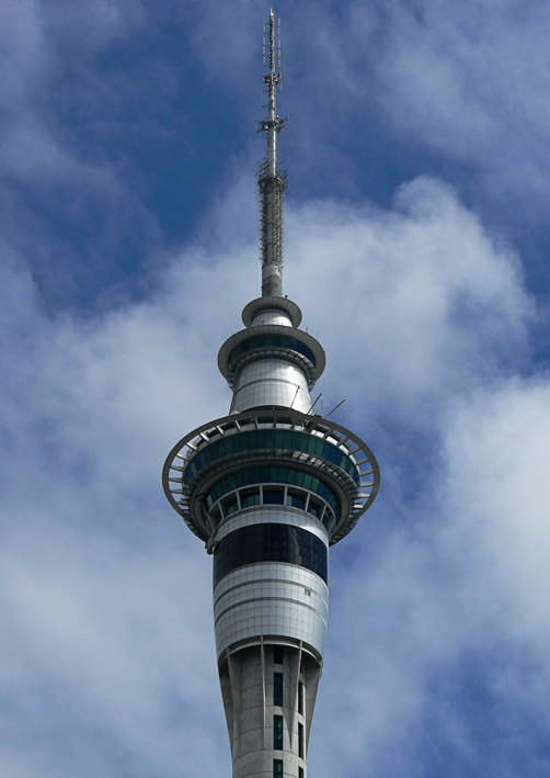
Sky Tower – watercolour and acrylic, 295 x 210 mm, 2013
Sky Tower – Auckland, 2007
Here is Auckland’s Sky Tower ― the tallest man-made structure in New Zealand ― surrounded by little fluffy clouds. The sketch was an exercise in simplicity and contrast. Left to my own devices, I would have added more details and shading, but that’s not really the point of this exercise. I used watercolour pencils and my new Molotow acrylic paint markers (oh what a wonderful world we live in!).
I’m a little jealous of American-born artist and designer Edward McKnight Kauffer (1890–1954). He studied in Paris, illustrated several of T. S. Eliot’s books (apparently he was Eliot’s preferred illustrator) and designed posters for the London Underground. Not a bad career.
In the style of… appears occasionally instead of my regular Shoot it, Sketch it posts. Using my own photographs as a starting point, I’m drawing inspiration from some of the world’s greatest illustrators. It’s not about slavishly copying someone else’s art; it’s an experiment in seeing things differently.
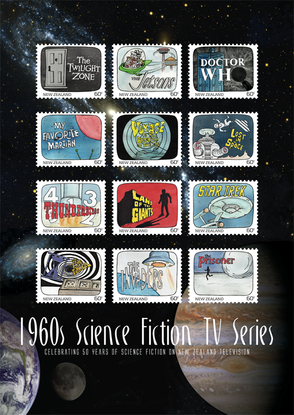
Science Fiction stamp poster (594 x 420 mm) Stars and planets (background collage) courtesy of the Internet Student project, 2011
Another one of my favourite designs at college was this stamp poster (and all of the stamps). Below is the text I wrote as part of the project:
Commemorating 50 years of science fiction on television in New Zealand, this collection features illustrations of some of the 1960s most iconic science fiction programmes.
Television arrived in New Zealand homes at a time when great advances were being made in space exploration. The 1960s was a decade obsessed with the “space race” as the Soviet Union and the United States competed to put a man on the moon. These 12 stamps depict television shows that tapped into our fascination with space and space travel. There were tales of friendly aliens living among us and of hostile alien invasions; journeys into our possible future and into the questionable past; galaxies filled with spaceships, robots and strange new worlds.
This post is the last of my Dear diary series… but I think I’ll start blogging about the artwork for these stamps — because stamps are cool : )
The diary pages are from a journal I designed for my Design & Arts College exhibition in 2012. Two years of research, ideas, word maps and sketches had to be reduced to a mere 72 pages. It was no easy task but I now have a beautiful, professionally bound diary that I’ll always treasure.