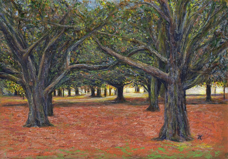
Sunlight is green – acrylic on watercolour paper, 205 x 295 mm, 2013.
Here, as promised, is my painting of the sunset in Hagley Park (taken from the same photo I sketched last week). If you’re wondering about the title, it was inspired by something I read in The Acrylic Artist’s Guide to Exceptional Colour by Lexi Sundell. Apparently there is research to suggest that sunlight is not yellow but pale green. Think about that for a minute. Green is a cool colour but sunlight is warm. Other research suggests it may be pale blue. Whatever it is, it seems sunlight is not a warm colour. I don’t know about you but that thought really messes with my head.
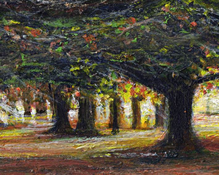
Sunlight is green – acrylic on watercolour paper, detail.
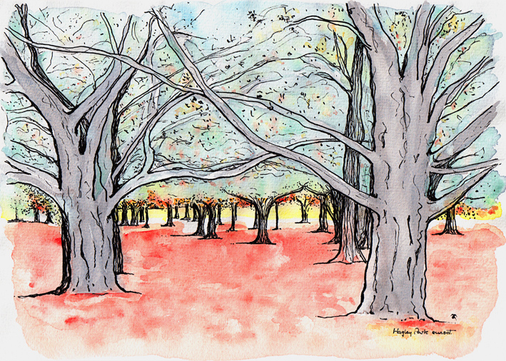
Hagley Park sunset sketch – ink and watercolour, 205 x 290 mm, 2013.Hagley Park sunset – Christchurch, 2010.
A last-minute sketch of the last minutes of a sunset in Hagley Park (because the acrylic painting I had planned to post today isn’t quite finished yet). I hope you’ll forgive the slightly blurry photo (my fault for not taking a tripod). Sunsets in the park can be spectacular at this time of year ― yes, we’re well and truly into autumn now in Christchurch.
Straven Road, 2013.Straven Road, original photo – Christchurch, 2013.
Last week, I had one of those ‘so that’s how they do it’ moments. I read about a clever piece of kit called a tilt-shift lens (used by photographers to control the way perspective appears in an image) and a way of mimicking the lens in Photoshop. With the right photo, you can digitally blur and manipulate it to make places and people look like miniatures. Even without the right photo, it’s still an interesting effect.
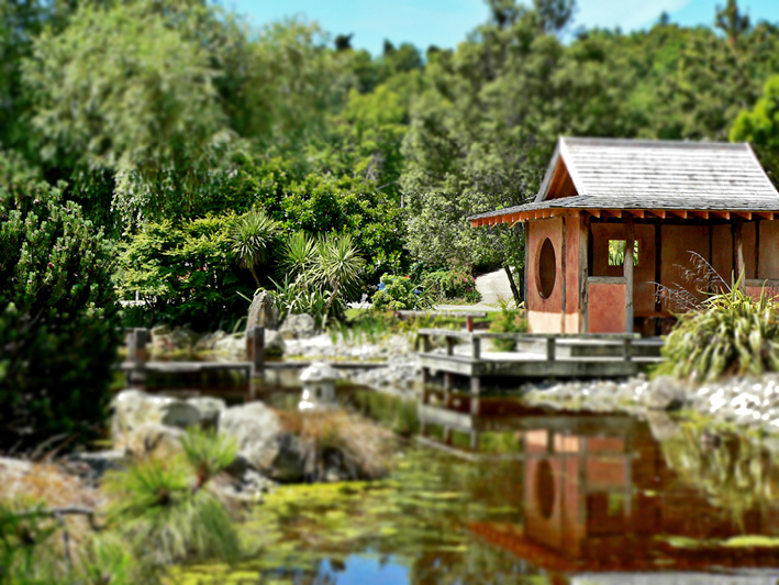
Miyazu Garden, 2013.Miyazu Garden, original photo – Nelson, 2011.
The latest version of Photoshop apparently has a ‘tilt shift’ blur feature but, really, it’s pretty straightforward: apply a reflected gradient and a lens blur so that parts of the image are out of focus, then adjust saturation and contrast to make the colours look more artificial.
The effect tends to work best with photos of people/vehicles/buildings taken from an elevated viewpoint. You don’t have to hire a helicopter to get a suitable photo… but climbing several flights of stairs to get just a little bit higher could make all the difference. With that in mind, I’m now on the hunt for really good photos to miniaturise : )
My thanks to Hovercraftdoggy for their inspirational We make models post (which includes a link to a tilt-shift photography Photoshop tutorial).
This week’s Shoot it, Sketch it photograph was taken around the corner from our house last autumn. You can just make out the curve of the little footbridge in the blurry distance. Is it just me or does the light shining through the willows look like fairylights?
Smartlea Street Bridge – ink, watercolour and digital, 215 x 175 mm, 2013.Smartlea Street Bridge, detail – ink, watercolour and digital, 2013.
The short story ~ the sketch is an ink and watercolour painting that has been altered using a kind of digital-resist effect (a combination of Photoshop filters that mimic the wax-resist technique used in making batik).
The long story ~ I’m going through an experimental phase. I’m curious to see what happens when I venture out of my comfort zone (ink drawings with lots of fiddly details and carefully considered watercolour and acrylic paintings) — I want to explore different ways of seeing things and be less concerned about the end result. What if…? That’s what happened in A trip down memory lane and it’s what happened here. Smartlea Street Bridge began as an ink and watercolour sketch which I then drew over with a brush pen to thicken the lines and make some areas inky black. The final image was created in Photoshop by inverting a scanned copy of the painting and applying various filters. The batik effect was discovered through trial and error.
Being out of my comfort zone does have one little drawback — it’s not very comfortable. I’m having to resist the urge to edit the light and dark areas to make them look more like the original photo. But so far, so good…
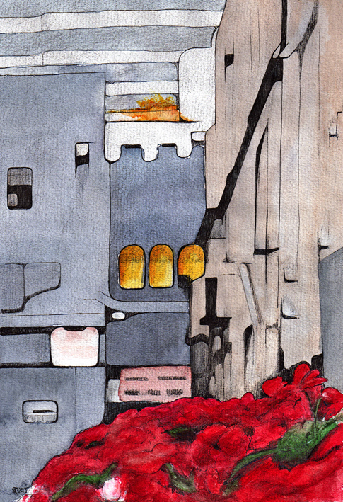
I was looking for photographs to put on my new portfolio site over the weekend when I came across an image I’d completely forgotten about. It’s a picture of Press Lane in central Christchurch taken a few months before the September 2010 earthquake.
Press Lane – mixed media, 290 x 205 mm, 2013.
I wish it wasn’t quite so hard to tell what the image is (you’re looking over a flower box, down the lane and seeing the buildings in the next street). My husband took a long, hard look at it and announced that I had drawn a kitchen ― and I can see it too now! It was still an interesting exercise… putting my own spin on the out-of-focus shapes and shadows.
The sketch is mainly ink and watercolour with touches of gouache and graphite. I’m not sure what the splash of orange is at the top (I’m sure the building wasn’t on fire) but it was in the photo, so it’s in the sketch : )