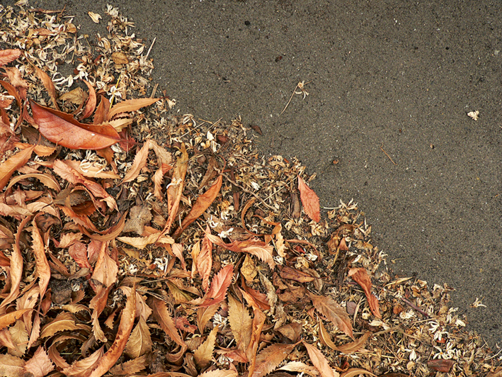
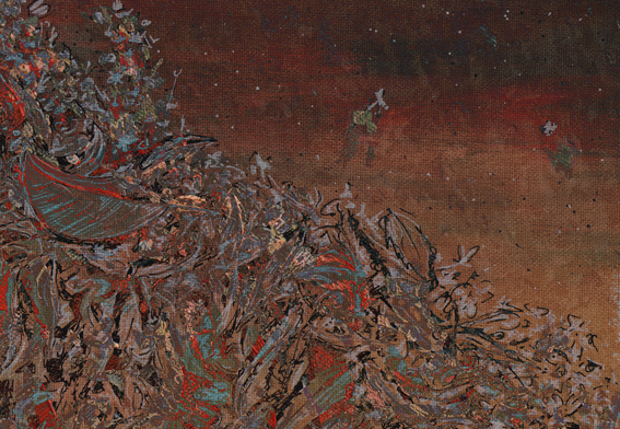
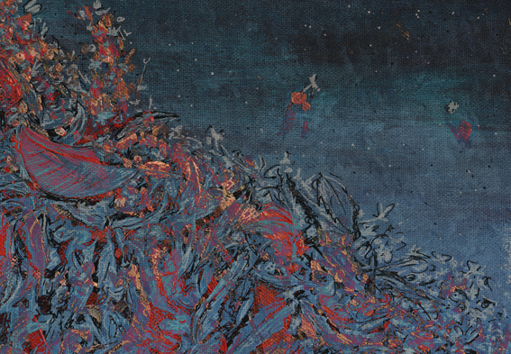
Today’s Shoot it, Sketch it is yet another experiment. The inspiration was a photograph taken at our back door last April. Something about the dry, curly leaves and the tiny, creamy white petals really appealed to me.
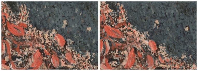
Autumn calling – acrylic on canvas, diptych: each panel 125 x 175 mm, 2013
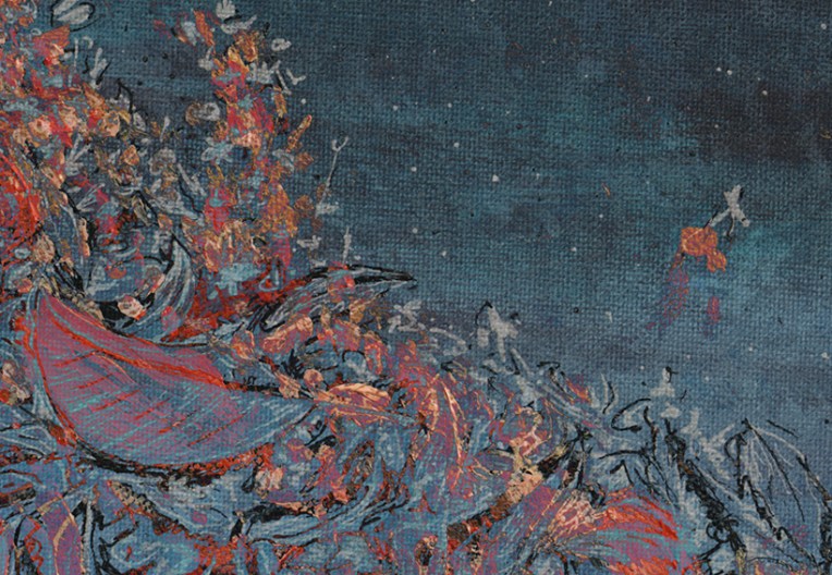
I painted it three times ― twice with brushes (above) and a third time with a palette knife (using the leftover paint for the background) and acrylic paint markers (below).
Autumn calling – acrylic on canvas, 165 x 215 mm, 2013
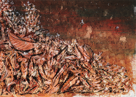
Then I combined the three paintings in Photoshop and tweaked a few filters to create the series below.
St Germain and the Tree – ink and watercolour, 297 x 210 mm, 2013
St Germain – Christchurch, 2010
If this looks a little familiar, that’s probably because the reference photograph was taken right next to the one I used for last week’s sketch. This time I used watercolour pencils and my trusty Staedtler pigment liners and took inspiration from one of my favourite illustrators, Maurice Sendak. You can see the early stages of my sketch below. (St Germain is the name of the restaurant in the photo.)
Work in progress #1 – watercolour pencil sketch Work in progress #2 – after adding water
Maurice Sendak
Maurice Sendak – illustrations from Where the Wild Things Are (1963) Images from http://mrbiggs.com
Everyone has heard of American illustrator and author Maurice Sendak (1928–2012), haven’t they? And even if you don’t know his name, I’m sure you’ll be familiar with his wonderful book Where the Wild Things Are.
In the style of… appears occasionally instead of my regular Shoot it, Sketch it posts. Using my own photographs as a starting point, I’m drawing inspiration from some of the world’s greatest illustrators. It’s not about slavishly copying someone else’s art; it’s an experiment in seeing things differently.
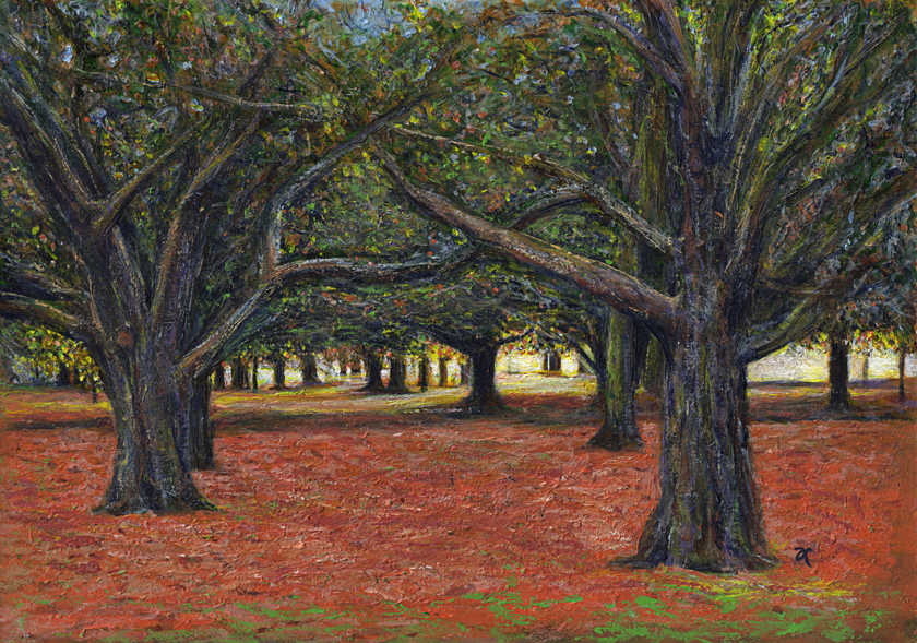
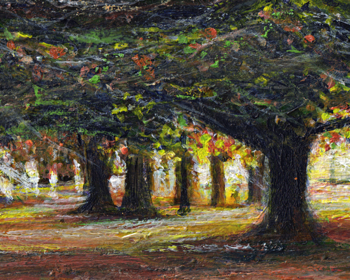
Sunlight is green – acrylic on watercolour paper, 205 x 295 mm, 2013.
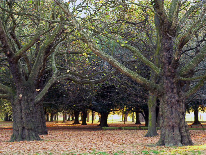
Here, as promised, is my painting of the sunset in Hagley Park (taken from the same photo I sketched last week). If you’re wondering about the title, it was inspired by something I read in The Acrylic Artist’s Guide to Exceptional Colour by Lexi Sundell. Apparently there is research to suggest that sunlight is not yellow but pale green. Think about that for a minute. Green is a cool colour but sunlight is warm. Other research suggests it may be pale blue. Whatever it is, it seems sunlight is not a warm colour. I don’t know about you but that thought really messes with my head.
Sunlight is green – acrylic on watercolour paper, detail.
Hagley Park sunset sketch – ink and watercolour, 205 x 290 mm, 2013.
Hagley Park sunset – Christchurch, 2010.
A last-minute sketch of the last minutes of a sunset in Hagley Park (because the acrylic painting I had planned to post today isn’t quite finished yet). I hope you’ll forgive the slightly blurry photo (my fault for not taking a tripod). Sunsets in the park can be spectacular at this time of year ― yes, we’re well and truly into autumn now in Christchurch.
This week’s Shoot it, Sketch it photograph was taken around the corner from our house last autumn. You can just make out the curve of the little footbridge in the blurry distance. Is it just me or does the light shining through the willows look like fairylights?
Smartlea Street Bridge – ink, watercolour and digital, 215 x 175 mm, 2013.
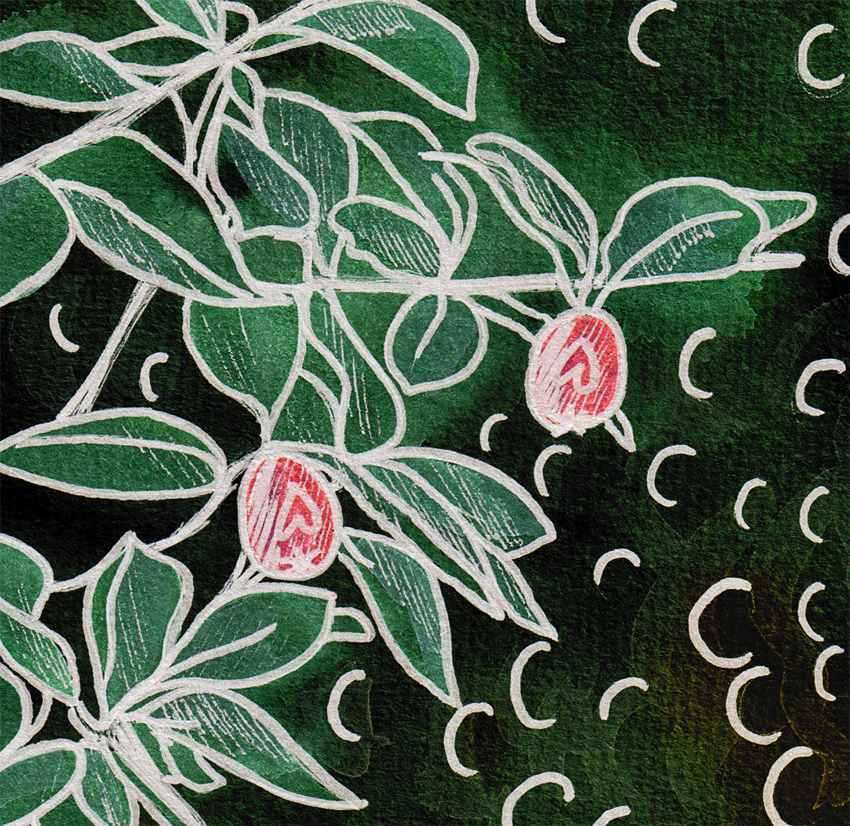
Smartlea Street Bridge, detail – ink, watercolour and digital, 2013.
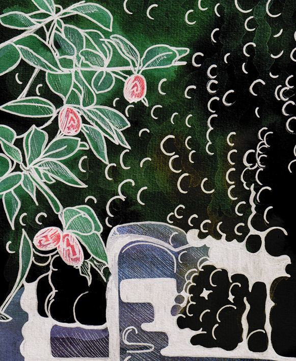
The short story ~ the sketch is an ink and watercolour painting that has been altered using a kind of digital-resist effect (a combination of Photoshop filters that mimic the wax-resist technique used in making batik).
The long story ~ I’m going through an experimental phase. I’m curious to see what happens when I venture out of my comfort zone (ink drawings with lots of fiddly details and carefully considered watercolour and acrylic paintings) — I want to explore different ways of seeing things and be less concerned about the end result. What if…? That’s what happened in A trip down memory lane and it’s what happened here. Smartlea Street Bridge began as an ink and watercolour sketch which I then drew over with a brush pen to thicken the lines and make some areas inky black. The final image was created in Photoshop by inverting a scanned copy of the painting and applying various filters. The batik effect was discovered through trial and error.
Being out of my comfort zone does have one little drawback — it’s not very comfortable. I’m having to resist the urge to edit the light and dark areas to make them look more like the original photo. But so far, so good…