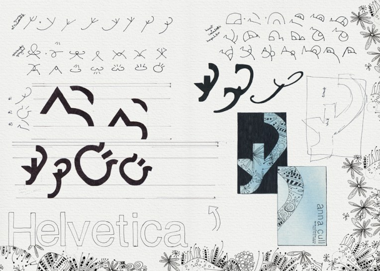
Personal logo – generating and refining ideas and thumbnail sketches Visual diary, two-page spread (student project, 2010)Personal logo and business card – recreating the logo using parts of a single typeface Visual diary, two-page spread (student project, 2010)
A recent blog post by graphic designer Becca Shayne about the value of keeping a sketchbook reminded me of the visual diary I put together for my Design & Arts College exhibition in 2012. All of my course sketchbooks (crammed full of research, ideas, inspirational quotes, word maps, doodles and sketches) had to be edited into a single, professionally printed journal of only 72 pages. It was no easy task but it’s something I’ll always treasure.
These are the diary pages of our very first project: to design our own logo and business card. I really enjoyed the process but I didn’t like the logo enough to use it. I’m still very fond of Helvetica though.
This is something I made for one of my best friends ― along the same lines (so to speak) as the image I’m currently using as my WordPress Gravatar. Both drawings are based on a Vectortuts+ tutorial that gives step-by-step instructions for turning a photograph into a digital drawing in the style of 1960s pop artist Roy Lichtenstein. Now I’m wondering if I can convince her to dye her hair purple!
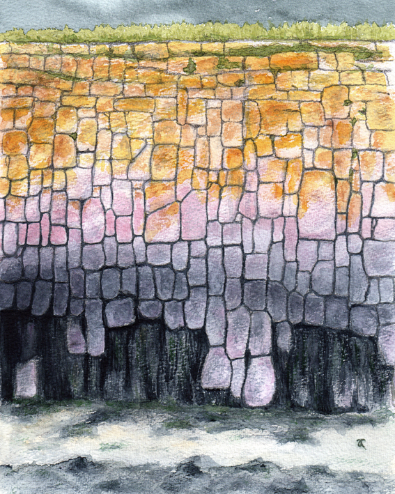
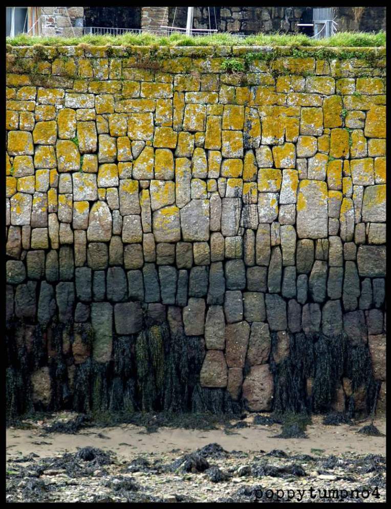
Last month, fellow blogger/artist/photographer Poppytump posted a wonderful photo of this wall (used with permission) ― and now it’s the world’s first ever Poppytump shot it, Anna sketched it. Thank you, Poppy : )
Harbour wall detail — the painted texture is a ‘dry brush’ watercolour effect.
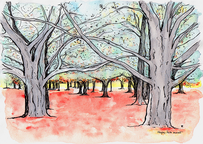
Hagley Park sunset sketch – ink and watercolour, 205 x 290 mm, 2013.Hagley Park sunset – Christchurch, 2010.
A last-minute sketch of the last minutes of a sunset in Hagley Park (because the acrylic painting I had planned to post today isn’t quite finished yet). I hope you’ll forgive the slightly blurry photo (my fault for not taking a tripod). Sunsets in the park can be spectacular at this time of year ― yes, we’re well and truly into autumn now in Christchurch.
This week’s Shoot it, Sketch it photograph was taken around the corner from our house last autumn. You can just make out the curve of the little footbridge in the blurry distance. Is it just me or does the light shining through the willows look like fairylights?
Smartlea Street Bridge – ink, watercolour and digital, 215 x 175 mm, 2013.Smartlea Street Bridge, detail – ink, watercolour and digital, 2013.
The short story ~ the sketch is an ink and watercolour painting that has been altered using a kind of digital-resist effect (a combination of Photoshop filters that mimic the wax-resist technique used in making batik).
The long story ~ I’m going through an experimental phase. I’m curious to see what happens when I venture out of my comfort zone (ink drawings with lots of fiddly details and carefully considered watercolour and acrylic paintings) — I want to explore different ways of seeing things and be less concerned about the end result. What if…? That’s what happened in A trip down memory lane and it’s what happened here. Smartlea Street Bridge began as an ink and watercolour sketch which I then drew over with a brush pen to thicken the lines and make some areas inky black. The final image was created in Photoshop by inverting a scanned copy of the painting and applying various filters. The batik effect was discovered through trial and error.
Being out of my comfort zone does have one little drawback — it’s not very comfortable. I’m having to resist the urge to edit the light and dark areas to make them look more like the original photo. But so far, so good…