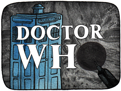
Doctor Who (1963-1989): The BBC originally promoted the classic series as an educational programme for children. It follows the adventures of a time-travelling alien known as the Doctor. The stamp depicts the opening titles, the Doctor’s TARDIS (a spaceship which looks like a British police box but has the ability to travel through space and time), and the first appearance of the alien race known as the Daleks (the episode aired 21/12/1963). Doctor Who went into production again in 2005 and has become the longest-running science fiction TV show in history.
The stamp design, poster and text are from one of my favourite student projects. Each stamp depicts an iconic science fiction TV series from the 1960s. I’ve been posting the stamps to commemorate the 50th anniversary of Doctor Who. Happy anniversary, Doctor!
Stamp design, artwork – mixed media – student project, 2011
Five… four… three… two… one… Thunderbirds are go!!! (Click here to listen to the theme music.)
Thunderbirds (1965-1966): A marionette puppet series (dubbed ‘supermarionation’ by the show’s creator, Gerry Anderson) set in the then-future of the 21st Century. It follows the adventures of the secret organisation International Rescue. The stamp is inspired by the countdown in the opening title sequence.
The stamp design, poster and text are from one of my favourite student projects. Each stamp depicts an iconic science fiction TV series from the 1960s. For a recap on the project, click here.
This adorable little building is Shand’s Emporium. I remember it as a magical place packed floor to ceiling with antiques, collectables, jewellery and books. Built in 1860, it is one of Christchurch’s oldest commercial buildings. It was meant to be demolished in the late 1970s (to make way for a new telephone exchange) but was saved by petition and while the more modern buildings surrounding it have been taken out by earthquakes, somehow Shand’s has survived. It has had some repairs since then but it needs an estimated $250,000 to fully restore it. The building is going to be relocated to prevent it from being damaged by nearby construction work. The owner is, in fact, giving the building away in an attempt to preserve it ― and yes, I was a little bit tempted, but I didn’t think we’d get it down our driveway. Shand’s will probably be in its new home by Christmas.
P.S. There are plans to move Shand’s to the delightful suburb of Redcliffs (by the estuary) early next year. It has been reported that a local man is prepared to spend the best part of a year restoring the building ― although it will depend on the city council’s master plan for the area. Here’s hoping this story has a happy ending. December 2013
The sketch is originally from this student project (click on the link and scroll down). The photographs were taken last month. Ben Heine’s ingenious Pencil Vs Camera images were my inspiration. This is my third ‘pen vs earthquake’ ― below are links to the first two.
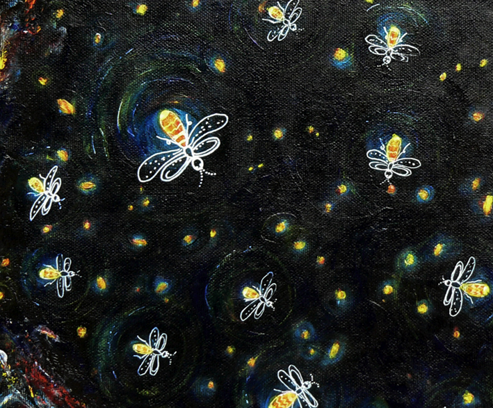
In the art cave – acrylic on canvas (detail), 2013
I’ve spent the last 18 months (and 200 posts) experimenting quite a lot with different styles and mediums, researching artists and illustrators, and stretching my creative wings. I completed my first commission a couple of months ago and now it seems the time has come to start putting my art ‘out there’ — for sale, I mean. So I’ve started to rework some of my earlier pieces with this in mind…
This firefly painting began life as a mixed media collage. Turning it into a painting proved to be a bit of a challenge but I got there in the end.
Housekeeping notes: as well as changing my WordPress header, I’ve also changed the title of my blog (just the name, not the URL/web address) from ‘Anna Cull ~ illustration & design’ to ‘in the art cave’ — oh and I’ve updated my About page too.
Stamp design, artwork – mixed media – student project, 2011
The future seems like only yesterday…
Voyage to the Bottom of the Sea (1964-1968): Set in the future of the 1970s/1980s, the series centres on the atomic submarine Seaview and its crew whose secret mission is to defend the Earth. It was based on the 1961 film of the same name.
The stamp design, poster and text are from one of my favourite student projects. Each stamp depicts an iconic science fiction TV series from the 1960s. For a recap on the project, click here.
Pen vs earthquake #2 – The Octagon, Design & Arts College and the Hotel Grand Chancellor, 2013
The beautiful building in the foreground, formerly the Trinity Congregational Church, was a restaurant and live music venue (Octagon Live) when this sketch was done. Built between 1873 and 1875, it sustained a lot of damage in the 2010/2011 earthquakes. There are plans to restore the timber interior and the 1871 pipe organ (thought to be one of only three of its kind left in the world).
The building to the right of the church was my old art school (you can’t tell from the photo but it’s in a very sorry state ― it was deemed unsafe following the February 2011 earthquake and put on the city’s ‘partial demolish’ list). The building on the left, the one on a bit of a lean, was the Hotel Grand Chancellor (now demolished). The hotel was built in 1986 and was Christchurch’s tallest building for more than 20 years.
The sketch is originally from this student project (click on the link and scroll down). The photographs were taken last week. Ben Heine’s ingenious Pencil Vs Camera images were my inspiration. This is my second ‘pen vs earthquake’ ― below is a link to the first one.