Historic Empire Hotel, Ross – ink and watercolour, 200 x 255 mm, 2013Historic Empire Hotel – Ross, 2013
Fresh off the drawing board, here is a little sketch of the hotel we stayed at in Ross last weekend. The town was established in 1865 during the West Coast gold rush and once had a population of more than 3,000 ― now it’s closer to 300. We had a wonderful time at a friend’s ‘When I’m 64’ birthday party and jam night : )
On the way there, I took a few photos of the mountains which are looking positively picturesque at the moment (Christchurch to Ross via Arthur’s Pass). I’ve posted my absolute favourite shots on my Facebook page.
Mona Vale restaurant and function centre was damaged quite badly in the February 2011 earthquakes. The 5.5 hectares of gardens are still open to the public but the beautiful historic homestead needs a lot of TLC to restore it to its former glory. Mona Vale used to be one of our favourite places for special occasions and we miss it dearly.
The idea for this photo shoot came from Ben Heine’s ingenious Pencil Vs Camera images. I have a number of sketches I’d like to photograph in situ like this ― all are from this student project (click on the link and scroll down).
The sketch is from my time at art college (2011). I took the photographs last week.
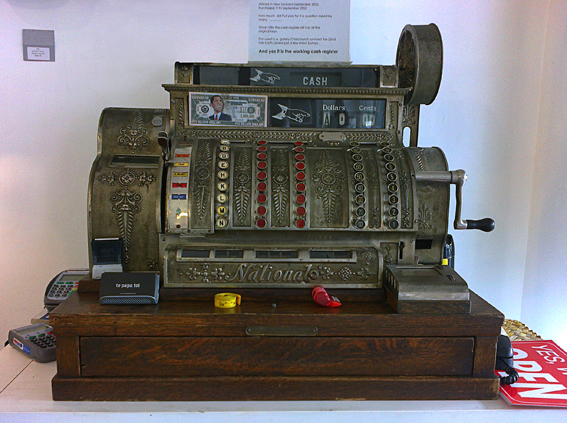
Survivor – ink and coloured pencil, 195 x 220 mm, 2013The old cash register – Tauranga, 2013
We discovered this beautiful antique in an art gallery while we were away on holiday. The till and its owner used to live in Christchurch but moved because of recent events (such as earthquakes) ― the sign says it’s still in good working order!
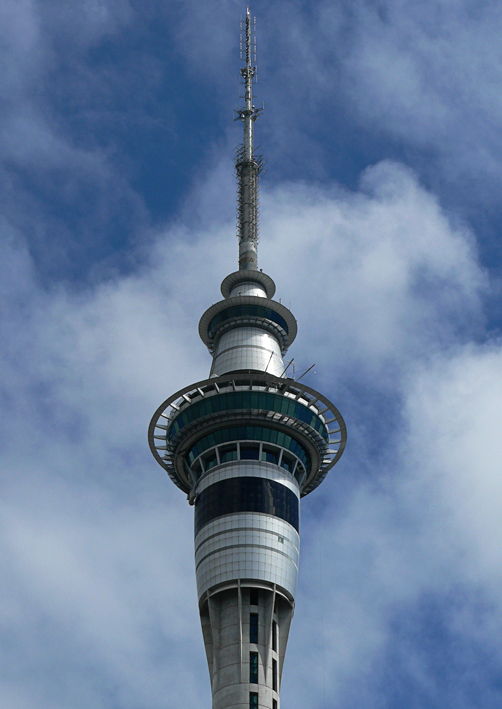
Sky Tower – watercolour and acrylic, 295 x 210 mm, 2013Sky Tower – Auckland, 2007
Here is Auckland’s Sky Tower ― the tallest man-made structure in New Zealand ― surrounded by little fluffy clouds. The sketch was an exercise in simplicity and contrast. Left to my own devices, I would have added more details and shading, but that’s not really the point of this exercise. I used watercolour pencils and my new Molotow acrylic paint markers (oh what a wonderful world we live in!).
I’m a little jealous of American-born artist and designer Edward McKnight Kauffer (1890–1954). He studied in Paris, illustrated several of T. S. Eliot’s books (apparently he was Eliot’s preferred illustrator) and designed posters for the London Underground. Not a bad career.
In the style of… appears occasionally instead of my regular Shoot it, Sketch it posts. Using my own photographs as a starting point, I’m drawing inspiration from some of the world’s greatest illustrators. It’s not about slavishly copying someone else’s art; it’s an experiment in seeing things differently.
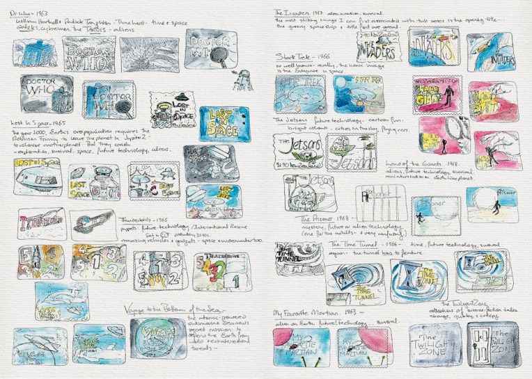
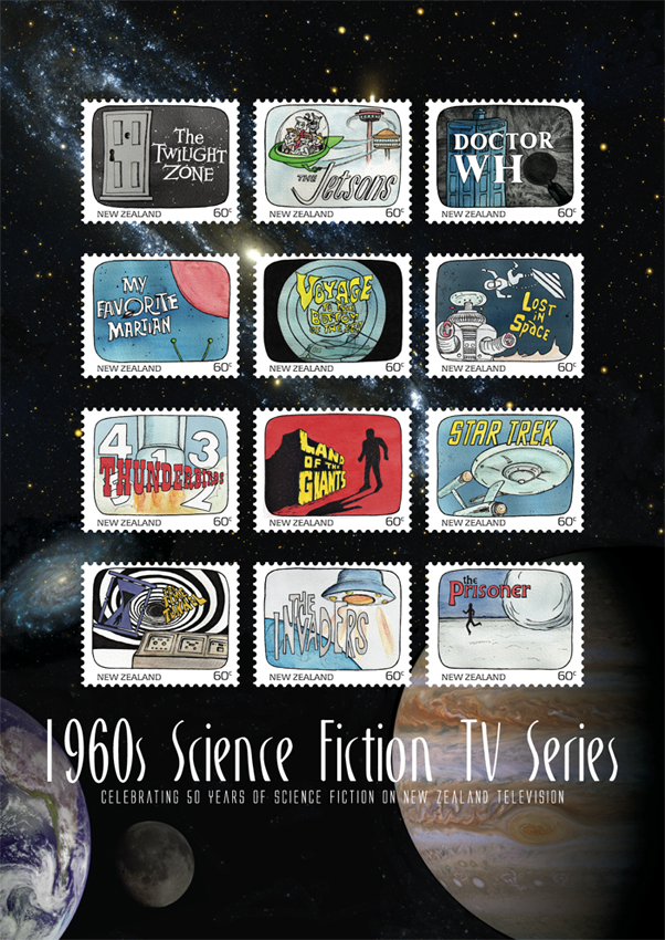
Science Fiction stamp design – sketches Visual diary, two-page spread (student project, 2011)Science Fiction stamp poster (594 x 420 mm) Stars and planets (background collage) courtesy of the Internet Student project, 2011
Another one of my favourite designs at college was this stamp poster (and all of the stamps). Below is the text I wrote as part of the project:
Commemorating 50 years of science fiction on television in New Zealand, this collection features illustrations of some of the 1960s most iconic science fiction programmes.
Television arrived in New Zealand homes at a time when great advances were being made in space exploration. The 1960s was a decade obsessed with the “space race” as the Soviet Union and the United States competed to put a man on the moon. These 12 stamps depict television shows that tapped into our fascination with space and space travel. There were tales of friendly aliens living among us and of hostile alien invasions; journeys into our possible future and into the questionable past; galaxies filled with spaceships, robots and strange new worlds.
This post is the last of my Dear diary series… but I think I’ll start blogging about the artwork for these stamps — because stamps are cool : )
The diary pages are from a journal I designed for my Design & Arts College exhibition in 2012. Two years of research, ideas, word maps and sketches had to be reduced to a mere 72 pages. It was no easy task but I now have a beautiful, professionally bound diary that I’ll always treasure.
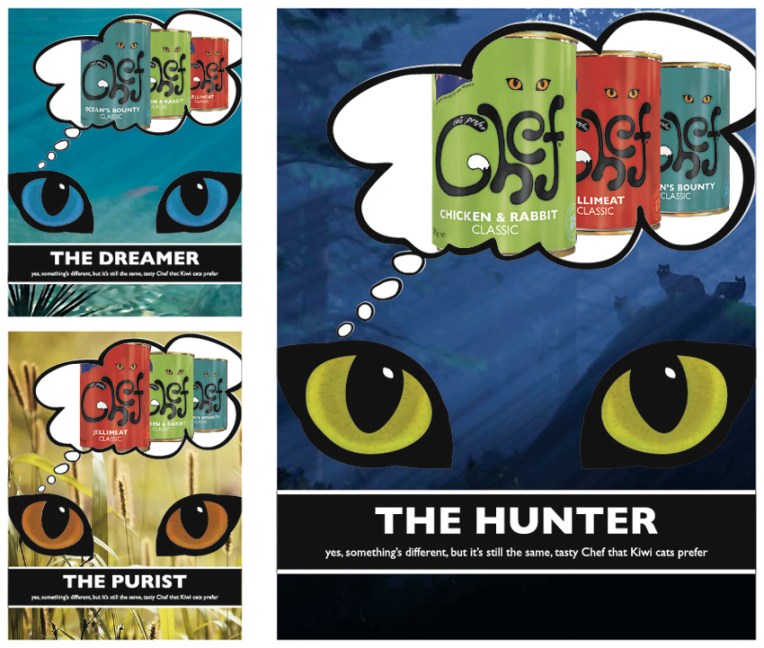
Chef logo, labels and rebranding campaign – concept development and final logo design Visual diary, two-page spread (student project, 2011)
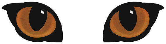
A full-on design challenge, this student project was all about the relaunch of one of New Zealand’s favourite pet foods: Chef. The secret life of the domestic cat was my inspiration — house cats are predators who, although wild at heart, always come home for Chef. I used a simple line drawing for the logo/body and Photoshopped the eyes (in detail below).
My Chef logo, labels and magazine advertising campaign. The background images used in the ads are courtesy of the Internet.
The diary pages are from a journal I designed for my Design & Arts College exhibition in 2012. Two years of research, ideas, word maps and sketches had to be reduced to a mere 72 pages. It was no easy task but I now have a beautiful, professionally bound diary that I’ll always treasure.