The Church is fine (pen vs earthquake)

Anna Cull Pen vs earthquake Oxford Tce

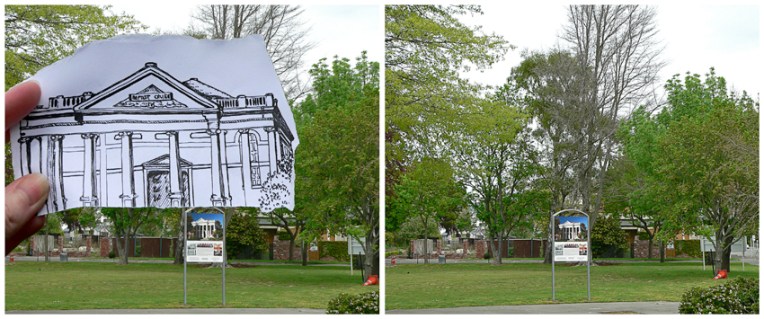
Built in 1881, the Oxford Terrace Baptist Church was one of the many buildings conspicuously absent from the landscape when we flew over Christchurch last month. I’ve circled the relevant piece of dirt in the photograph below (click on the photo for a closer look). The building was badly damaged by the September 2010 earthquakes and then completely collapsed in the February 2011 earthquake. It was famous for having a sign out the front which read: “Our building is cracked, the Church is fine!” Although the neoclassical structure (an unusual style for Christchurch) is not going to be rebuilt, there are reports that the damaged Oamaru stone is to be used in a sculpture ― what a wonderful way of honouring the spirit and tenacity of its congregation.

Where Oxford Terrace Baptist Church isn’t, Christchurch, 2013

Anna Cull Pen vs earthquake Oxford Tce comparison

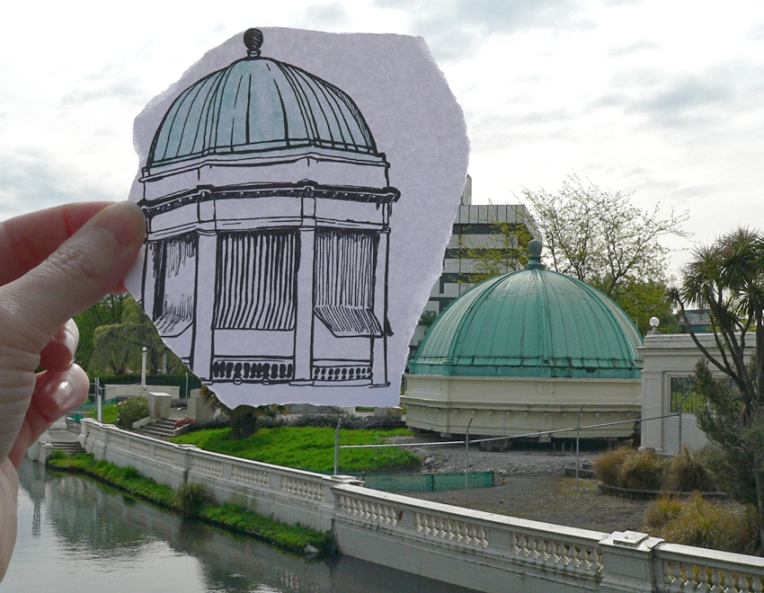
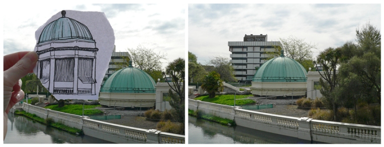
The sketch is originally from this student project. Ben Heine’s ingenious Pencil Vs Camera images were my inspiration for this series.

Re-tour (pen vs earthquake)

Pen vs earthquake #4 – Retour/Edmonds Band Rotunda, 2013

The iconic Thomas Edmonds band rotunda opened in 1929. It was converted into a restaurant in the 1980s and was operating as Retour Restaurant at the time of the Christchurch earthquakes. It was officially ‘deconstructed’ in 2012. The structurally sound dome has been removed and some of the less damaged columns, balustrades and steps have been salvaged. So at least that’s something.

My pen vs earthquake series is proving to be quite challenging. It’s taking me into parts of the inner city I haven’t seen for months and I’m never sure what I’m going to find… sometimes there is nothing left of the original building to photograph. How exactly do you photograph nothing? And why would you want to?

Anna Cull Pen vs earthquake Retour

The sketch is originally from this student project (click on the link and scroll down). The photographs were taken last month. Ben Heine’s amazing Pencil Vs Camera images were my initial inspiration. There are links below to more of my ‘pen vs earthquake’ images.

Pen vs earthquake #1 – Mona Vale, 2013

Pen vs earthquake #2 – The Octagon, Design & Arts College and the Hotel Grand Chancellor, 2013

Pen vs earthquake #3 – Shand’s Emporium, 2013

Happy anniversary, Doctor Who!

Stamp design, artwork – mixed media – student project, 2011

Doctor Who theme music

Doctor Who (1963-1989): The BBC originally promoted the classic series as an educational programme for children. It follows the adventures of a time-travelling alien known as the Doctor. The stamp depicts the opening titles, the Doctor’s TARDIS (a spaceship which looks like a British police box but has the ability to travel through space and time), and the first appearance of the alien race known as the Daleks (the episode aired 21/12/1963). Doctor Who went into production again in 2005 and has become the longest-running science fiction TV show in history.

The stamp design, poster and text are from one of my favourite student projects. Each stamp depicts an iconic science fiction TV series from the 1960s. I’ve been posting the stamps to commemorate the 50th anniversary of Doctor Who. Happy anniversary, Doctor!

Science Fiction stamp poster (594 x 420 mm) Stars and planets (background collage) courtesy of the Internet Student project, 2011
Science Fiction stamp poster – student project, 2011

Thunderbirds

Stamp design, artwork – mixed media – student project, 2011

Five…  four…  three…  two…  one…  Thunderbirds are go!!! (Click here to listen to the theme music.)

Thunderbirds (1965-1966): A marionette puppet series (dubbed ‘supermarionation’ by the show’s creator, Gerry Anderson) set in the then-future of the 21st Century. It follows the adventures of the secret organisation International Rescue. The stamp is inspired by the countdown in the opening title sequence.

The stamp design, poster and text are from one of my favourite student projects. Each stamp depicts an iconic science fiction TV series from the 1960s. For a recap on the project, click here.

Science Fiction stamp poster (594 x 420 mm) Stars and planets (background collage) courtesy of the Internet Student project, 2011
Science Fiction stamp poster – student project, 2011

Feisty (pen vs earthquake)

Pen vs earthquake #3 – Shand’s Emporium, 2013

This adorable little building is Shand’s Emporium. I remember it as a magical place packed floor to ceiling with antiques, collectables, jewellery and books. Built in 1860, it is one of Christchurch’s oldest commercial buildings. It was meant to be demolished in the late 1970s (to make way for a new telephone exchange) but was saved by petition and while the more modern buildings surrounding it have been taken out by earthquakes, somehow Shand’s has survived. It has had some repairs since then but it needs an estimated $250,000 to fully restore it. The building is going to be relocated to prevent it from being damaged by nearby construction work. The owner is, in fact, giving the building away in an attempt to preserve it ― and yes, I was a little bit tempted, but I didn’t think we’d get it down our driveway. Shand’s will probably be in its new home by Christmas.

P.S. There are plans to move Shand’s to the delightful suburb of Redcliffs (by the estuary) early next year. It has been reported that a local man is prepared to spend the best part of a year restoring the building ― although it will depend on the city council’s master plan for the area. Here’s hoping this story has a happy ending. December 2013

Update: Shand’s Emporium touches down on Manchester Street, Christchurch. June 2015

Anna Cull Pen vs earthquake Shands

The sketch is originally from this student project (click on the link and scroll down). The photographs were taken last month. Ben Heine’s ingenious Pencil Vs Camera images were my inspiration. This is my third ‘pen vs earthquake’ ― below are links to the first two.

Pen vs earthquake #1 – Mona Vale, 2013

Pen vs earthquake #2 – The Octagon, Design & Arts College and the Hotel Grand Chancellor, 2013

Number 200

In the art cave – acrylic on canvas (detail), 2013

I’ve spent the last 18 months (and 200 posts) experimenting quite a lot with different styles and mediums, researching artists and illustrators, and stretching my creative wings. I completed my first commission a couple of months ago and now it seems the time has come to start putting my art ‘out there’ — for sale, I mean. So I’ve started to rework some of my earlier pieces with this in mind…

This firefly painting began life as a mixed media collage. Turning it into a painting proved to be a bit of a challenge but I got there in the end.

Housekeeping notes: as well as changing my WordPress header, I’ve also changed the title of my blog (just the name, not the URL/web address) from ‘Anna Cull ~ illustration & design’ to ‘in the art cave’ — oh and I’ve updated my About page too.