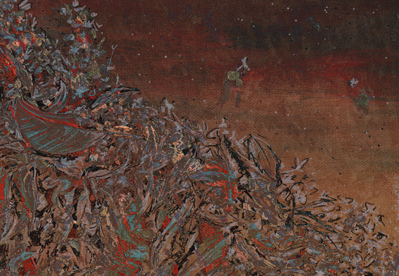
Stamp design, artwork – mixed media – student project, 2011
The future seems like only yesterday…
Voyage to the Bottom of the Sea (1964-1968): Set in the future of the 1970s/1980s, the series centres on the atomic submarine Seaview and its crew whose secret mission is to defend the Earth. It was based on the 1961 film of the same name.
The stamp design, poster and text are from one of my favourite student projects. Each stamp depicts an iconic science fiction TV series from the 1960s. For a recap on the project, click here.
Pen vs earthquake #2 – The Octagon, Design & Arts College and the Hotel Grand Chancellor, 2013
The beautiful building in the foreground, formerly the Trinity Congregational Church, was a restaurant and live music venue (Octagon Live) when this sketch was done. Built between 1873 and 1875, it sustained a lot of damage in the 2010/2011 earthquakes. There are plans to restore the timber interior and the 1871 pipe organ (thought to be one of only three of its kind left in the world).
The building to the right of the church was my old art school (you can’t tell from the photo but it’s in a very sorry state ― it was deemed unsafe following the February 2011 earthquake and put on the city’s ‘partial demolish’ list). The building on the left, the one on a bit of a lean, was the Hotel Grand Chancellor (now demolished). The hotel was built in 1986 and was Christchurch’s tallest building for more than 20 years.
The sketch is originally from this student project (click on the link and scroll down). The photographs were taken last week. Ben Heine’s ingenious Pencil Vs Camera images were my inspiration. This is my second ‘pen vs earthquake’ ― below is a link to the first one.
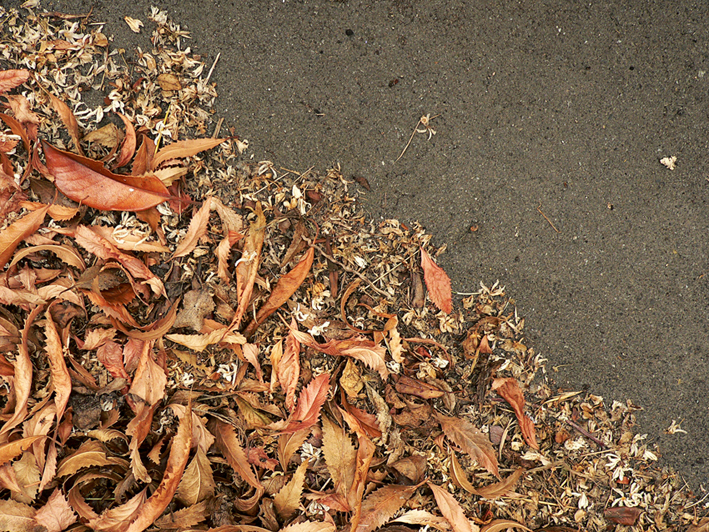
Today’s Shoot it, Sketch it is yet another experiment. The inspiration was a photograph taken at our back door last April. Something about the dry, curly leaves and the tiny, creamy white petals really appealed to me.
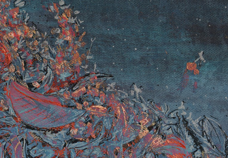
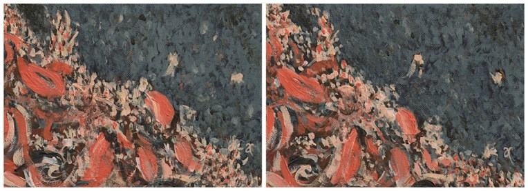
Autumn calling – acrylic on canvas, diptych: each panel 125 x 175 mm, 2013
I painted it three times ― twice with brushes (above) and a third time with a palette knife (using the leftover paint for the background) and acrylic paint markers (below).
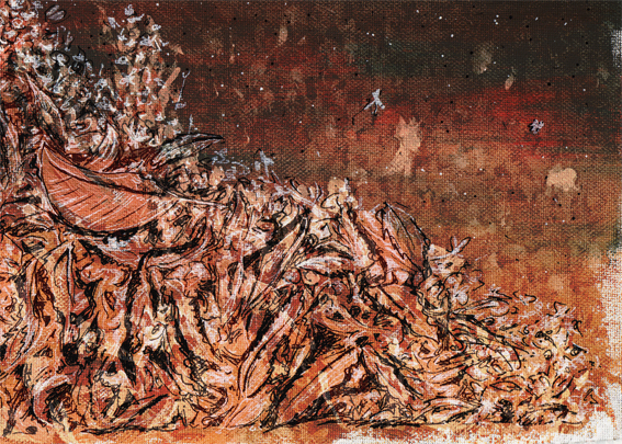
Autumn calling – acrylic on canvas, 165 x 215 mm, 2013
Then I combined the three paintings in Photoshop and tweaked a few filters to create the series below.
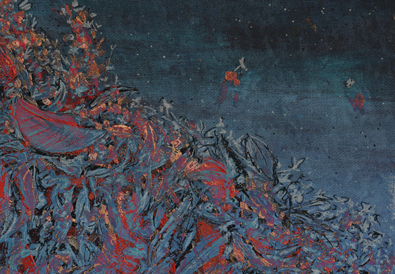
Stamp design, artwork – mixed media – student project, 2011
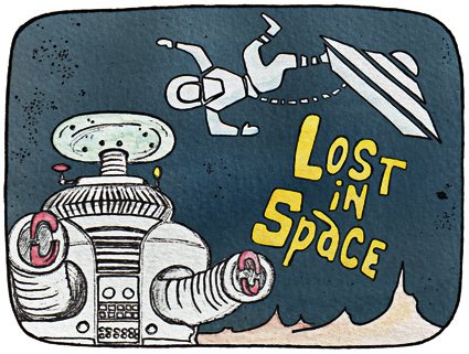
I used to love this series. It had the best robot EVER. And the theme music was fabulous too! It was written by John Williams — yes, the same John Williams who wrote the music for Star Wars. Click on the link below to hear the original Lost in Space theme music* (note: it takes about 40 seconds before it really gets started)…
Lost In Space (1965-1968): The year is 1997. The crew of the Jupiter 2 leaves an overpopulated Earth in the hope of finding a suitable world to colonise but an act of sabotage causes them to crash on an unknown planet. The stamp features images from the opening credits as well as the talking robot made famous by the series.
The stamp design, poster and text are from one of my favourite student projects. Each stamp depicts an iconic science fiction TV series from the 1960s. For a recap on the project, click here.
*I’ve just discovered a cool site with free TV theme tunes — so I’ve added a couple of groovy audio links to my The Prisoner and Star Trek stamp posts : )
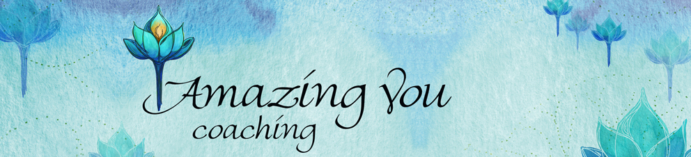
Sally’s logo and business card were a joy to design. The brief was to incorporate a blossoming flower (a lotus or a dahlia) and a dark-to-light-blue gradient (symbolising transformation) to give a sense of the personality and coaching style of the client ― who has a very positive, playful kind of energy. Several sketches, watercolour paintings and brainstorming sessions later, we had the Amazing You blue lotus logo ― and an entire blue lotus forest!
St Germain and the Tree – ink and watercolour, 297 x 210 mm, 2013
St Germain – Christchurch, 2010
If this looks a little familiar, that’s probably because the reference photograph was taken right next to the one I used for last week’s sketch. This time I used watercolour pencils and my trusty Staedtler pigment liners and took inspiration from one of my favourite illustrators, Maurice Sendak. You can see the early stages of my sketch below. (St Germain is the name of the restaurant in the photo.)
Work in progress #1 – watercolour pencil sketch Work in progress #2 – after adding water
Maurice Sendak
Maurice Sendak – illustrations from Where the Wild Things Are (1963) Images from http://mrbiggs.com
Everyone has heard of American illustrator and author Maurice Sendak (1928–2012), haven’t they? And even if you don’t know his name, I’m sure you’ll be familiar with his wonderful book Where the Wild Things Are.
In the style of… appears occasionally instead of my regular Shoot it, Sketch it posts. Using my own photographs as a starting point, I’m drawing inspiration from some of the world’s greatest illustrators. It’s not about slavishly copying someone else’s art; it’s an experiment in seeing things differently.