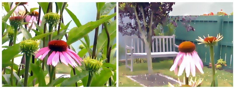
I have no idea where my original photographs are but these are the arty versions (created quite a few years ago using Corel Photo-Paint) that inspired the diptych below. How I wish our garden still looked this good!
Purple coneflower diptych – acrylic on textured card, 205 x 305 mm each, 2014
A loose, sketchy style seemed the thing for these two studies. I also used less intense, more natural colours and resisted the urge to define all the edges. In some ways they feel a little unfinished, like a work still in progress, and yet I can’t bring myself to add any more paint.
I made these faux wine labels for Sandra a.k.a. bagirl as props when we photographed her wine courier bags. Never one to let a design opportunity pass by, I made use of the watercolour background that I painted for her business cards/product labels.
And here they are in their supporting role with a couple of the wine couriers. Sandra and her bags will also be at Saturday’s craft fair in Halswell (Christchurch, New Zealand)*. Click here for details.
* PLEASE NOTE: Unfortunately, the craft fair was cancelled. Organisers say there were not enough stall holders to make it worthwhile holding the event.
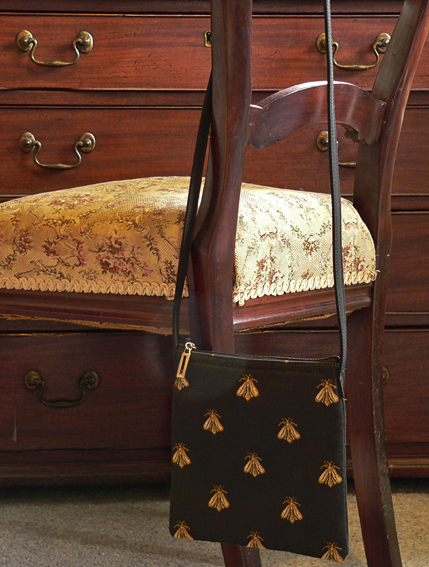
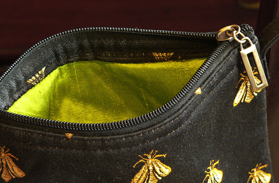
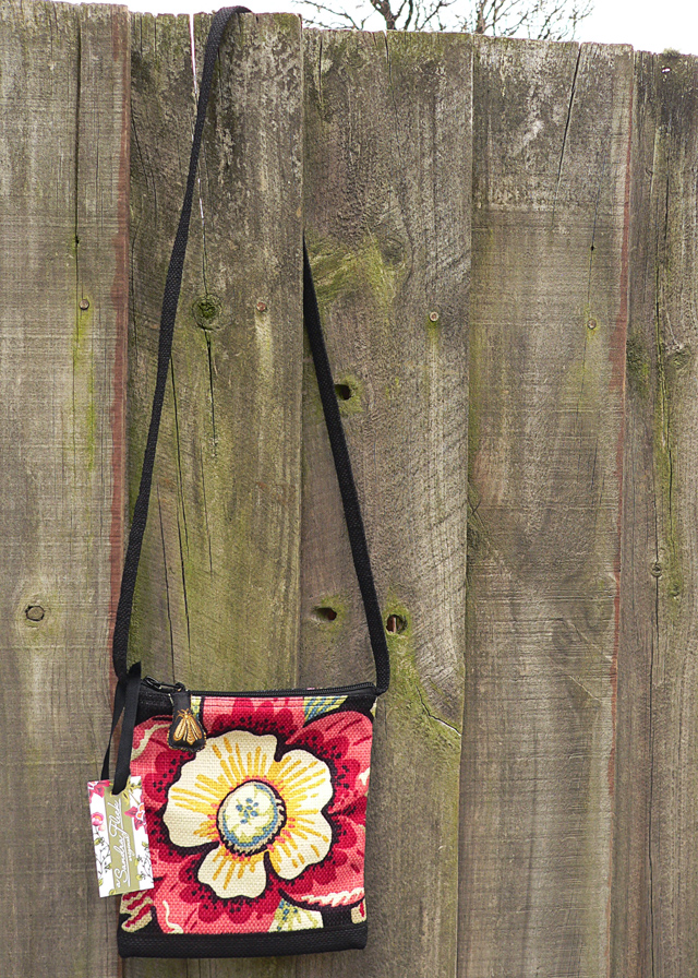
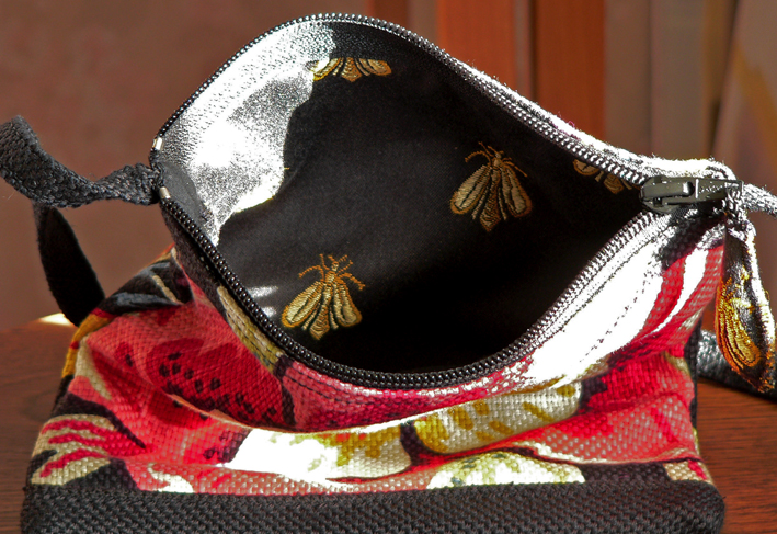
Last month I wrote a post about the wonderful bag that I designed and Sandra made for me. I actually ended up designing TWO bags (quite by accident). The first bag was lined with this lovely bee fabric (it used to be a pencil skirt). The vibrant, lime green lining is the most beautiful raw silk. Thank you, Sandra. It’s bee-utiful.
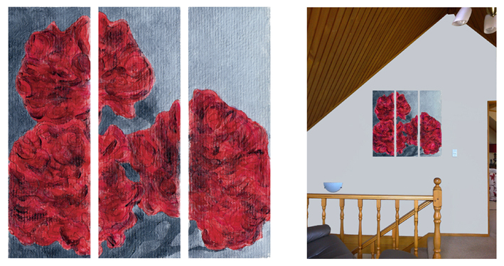
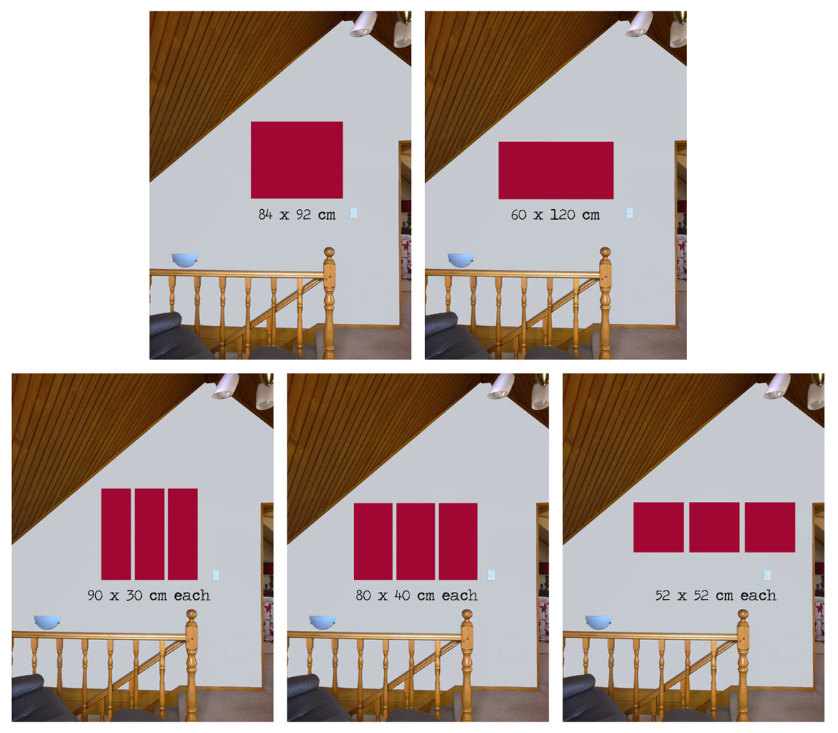
There was quite a bit of work behind the scenes before the brush ever touched the canvas. My client knew the subject and the colour that she wanted but hadn’t been able to find a painting or print to match her vision. I was commissioned to create an artwork ― any medium, any style ― of three red peony roses. Wow. Really? Okay.
I opted for an acrylic painting on stretched canvas. But what size should it be?
Mock-ups showing various options – the client chose the bottom left triptych
Because I was able to take photographs of the room, I decided to make several mock-ups of the canvas sizes that I thought would suit the space. My client chose a triptych measuring 100 x 100 cm. A sketch was approved and three canvases were ordered…
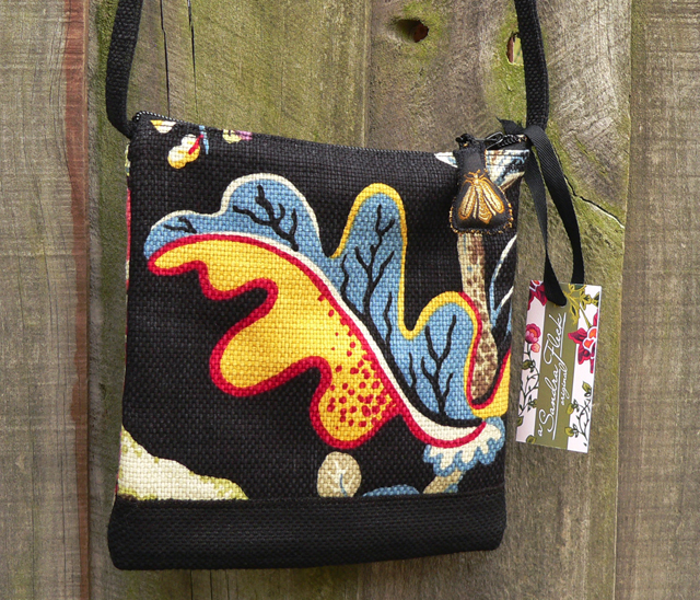
The best bag ever — was made for me by Sandra (bagirl)…
…looks great front and back…
…and has little bees hiding inside.
Sadly, I do not have my family’s sewing gene. I can draw and paint and knit and cross-stitch… but I can’t sew. How wonderful, then, to have a friend who can! We have a lot of fun rummaging through her fabulous fabric stash and coming up with all manner of unique creations.
This bag was Sandra’s way of thanking me for helping with her blog (I’m photographer-in-chief ― I also designed her business cards/product labels). I chose the fabric as well as the bag design. Long live the barter system : )
‘Trash your ash – play the game and everybody wins’ – sketches and final illustration Visual diary, two-page spread (student project, 2011)
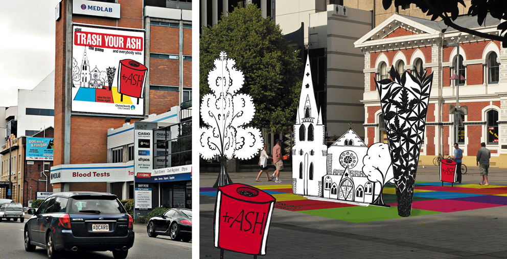
‘Trash your ash’ mock-ups (billboard and installation) – ink, photography and digital Student project, 2011
The brief for this project was to design an anti-cigarette-litter billboard and public installation for the city council’s ‘Future Vision of a Clean City’ campaign. The focus had to be on anti-not-thinking rather than anti-smoking. For the installation, I turned my drawing of Christchurch’s Anglican Cathedral and Chalice sculpture into a pop-up board game that could be played in public spaces around the city. It was a lot of fun putting my illustration into the photo ― I wonder why I don’t do that more often?
The diary pages are from a journal I designed for my Design & Arts College exhibition in 2012. Two years of research, ideas, word maps and sketches had to be reduced to a mere 72 pages. It was no easy task but it’s something I’ll always treasure.