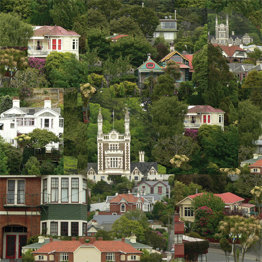
Dunedin, photo montage, 2013Work in progress # 1 – underpainting
I was so impressed with Dunedin’s gorgeous architecture when we were there on holiday last month that I went mad taking photographs ― but then I couldn’t decide which one to paint first… So I arranged a few favourites based on a nine-square grid (editing it in Photoshop and adding a few extra cabbage trees here and there). And now I’m painting it. This may take a while.
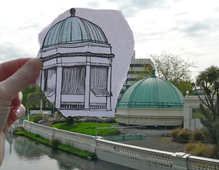
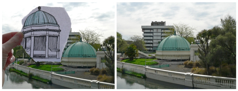
Pen vs earthquake #4 – Retour/Edmonds Band Rotunda, 2013
The iconic Thomas Edmonds band rotunda opened in 1929. It was converted into a restaurant in the 1980s and was operating as Retour Restaurant at the time of the Christchurch earthquakes. It was officially ‘deconstructed’ in 2012. The structurally sound dome has been removed and some of the less damaged columns, balustrades and steps have been salvaged. So at least that’s something.
My pen vs earthquake series is proving to be quite challenging. It’s taking me into parts of the inner city I haven’t seen for months and I’m never sure what I’m going to find… sometimes there is nothing left of the original building to photograph. How exactly do you photograph nothing? And why would you want to?
The sketch is originally from this student project (click on the link and scroll down). The photographs were taken last month. Ben Heine’s amazing Pencil Vs Camera images were my initial inspiration. There are links below to more of my ‘pen vs earthquake’ images.
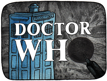
Doctor Who (1963-1989): The BBC originally promoted the classic series as an educational programme for children. It follows the adventures of a time-travelling alien known as the Doctor. The stamp depicts the opening titles, the Doctor’s TARDIS (a spaceship which looks like a British police box but has the ability to travel through space and time), and the first appearance of the alien race known as the Daleks (the episode aired 21/12/1963). Doctor Who went into production again in 2005 and has become the longest-running science fiction TV show in history.
The stamp design, poster and text are from one of my favourite student projects. Each stamp depicts an iconic science fiction TV series from the 1960s. I’ve been posting the stamps to commemorate the 50th anniversary of Doctor Who. Happy anniversary, Doctor!
Riding the falls – acrylic on canvas, 405 x 305 mm, 2013
CRAFT FAIR UPDATE: Unfortunately, this Saturday’s craft fair in Halswell (Christchurch, New Zealand) has been cancelled. The organisers say there weren’t enough stall holders to make it worthwhile. I find myself looking around the art cave at my freshly varnished paintings and thinking: what was all that about? Ah well, at least I’ll be prepared when the next art fair comes along!
So that’s the reason I’m posting Monday’s Shoot it, Sketch it a few days early (the painting is a reworking of Riding the waves) ― to let you know what’s happening (or not happening, as the case may be) and because it’s the perfect image for how I’m feeling at the moment.
Now I think I’ll have a few days off and turn my attention to more pressing matters… such as the 50th anniversary of Doctor Who this weekend : )
I made these faux wine labels for Sandra a.k.a. bagirl as props when we photographed her wine courier bags. Never one to let a design opportunity pass by, I made use of the watercolour background that I painted for her business cards/product labels.
And here they are in their supporting role with a couple of the wine couriers. Sandra and her bags will also be at Saturday’s craft fair in Halswell (Christchurch, New Zealand)*. Click here for details.
* PLEASE NOTE: Unfortunately, the craft fair was cancelled. Organisers say there were not enough stall holders to make it worthwhile holding the event.